


Roman Mars’ “Why city flags may be the worst-designed thing you’ve never noticed” is among my favorite TED Talks. The talk highlights both design’s civic importance, and why you want to find a life partner that looks at you the way Roman Mars looks at city flags.
At one point, Roman dives into how the North American Vexillological Association says that good flags obey five laws. Those laws are:
- simplicity
- using meaningful symbolism
- sticking to two or three colors
- having no seals or lettering; and
- being distinctive
One rule he omits, which the folks at the r/vexillology subreddit would insist is vital, is the rule of tincture. The rule of tincture comes from heraldry, and it says: avoid letting colors (e.g. blue, green, black, red, etc.) touch other colors, or metals (e.g. yellow/gold or white/silver) touch other metals. Colors should be offset with metals and vice versa.
Roman Mars’ TED talk has gone on to inspire city flag redesigns across the United States. Pocatello, Idaho ditched its infamous 1990s solo jazz flag for a more inspirational alternative. Milwaukee, Wisconsin has rallied around a new flag despite official reticence in adopting it. And presidential candidate Mayor Pete Buttigieg of South Bend, Indiana, pursued a city flag redesign to spur innovation in his town back in 2016. He called it an “appropriate exclamation point to the South Bend 150 celebration” and a “unifying symbol that lets all of us, literally, wear our city pride on our sleeve.”
Riverhead Town would similarly benefit from revising its flag.
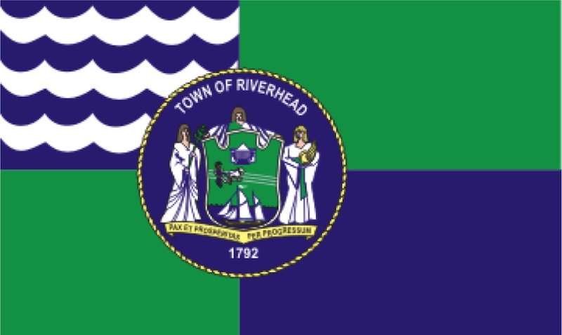
On the one hand, our town’s current flag is already most of the way to good flag design. It’s distinctive and, aside from the seal that adds golden elements, the flag sticks to three colors: blue, white, and green.
However, of the rules that the North American Vexillological Association lays out, the flag violates the first, third, and fourth, laws of good flag design. Aside from the aforementioned seal, the quadrisections are off-center: it’s neither a nordic cross nor four equal rectangles. The waves in the canton, i.e. the upper left corner, are irregular. As for rule of tincture, the blue and green colors placed against each other is off-putting, design-wise. That our town flag even has “Town of Riverhead” written on it means that its symbolism has failed.
Therefore, I’d like to propose revising our town flag in a way that retains its existing elements and character. It’s not so much an overhaul as it is a clarification and simplification of the existing flag. I’ll also walk through why I would propose these changes.
Redesign Process
First, let’s remove the seal. Using seals can inspire good flag design, as is the the City of Amsterdam’s case. They used the windmill ✕ from the City seal as a motif, creating what Roman Mars calls quote “the most “badass” city flag in the world.”
In our case, our town seal is simply too busy. The underlying flag design already exists, and it will suffice.

Flag without seal.
Removing the seal has the added bonus of also fixing the color limits issue. For there, we only need to make it conform to rule of tincture and simplify it further.
To demur a moment, one of my go-to design quotes is from Leo Tolstoy’s Anna Karenina: “All happy families are alike; each unhappy family is unhappy in its own way.” In a design context, it could mean “Don’t reinvent the wheel.” I take it to mean: “If you want to be successful yourself, mimic successful precedent.”
To that point: the waves on Riverhead’s flag are asymmetrical and haphazard. Given that vexillology has its roots in European heraldry, let’s see how heraldic coats of arms handle waves:

Given that the common practice is to represent waves as smooth, wavy lines; let’s opt for that. Let’s also make the blue lighter, since the flag’s current blue is more of a violet compared to what heraldry often uses.
Finally, to address both the rule of tincture and the asymmetry of the flag’s fields, let’s add a symmetric white cross in the middle. This brings balance to the flag.
The New Flag: A Source of Inspiration
Our town’s flag now retains the original flag’s best aspects, while also obeying all good flag design rules. Here it is:

The waves in the canton symbolize the Long Island Sound. The calm blue field in the lower right: the calm of Peconic Bay. The green fields: agriculture, wealth, and greater Long Island and the North Fork. The symmetrical white cross, our status as central spoke for Eastern Long Island commerce.
It may seem like a waste of time to focus on Riverhead’s flag design: our town’s master plan needs revision, there are insufficient parking spaces and pedestrian routes and climate change is poised to turn our entire town into beachfront property unless we take bold actions. But as Ted Kaye of the Portland Flag Association says: “If you [have] a great city flag, you… have a banner for people to rally under to face those more important things.” And I agree that our town would be much improved for it.
Imagine you’re waking up and you go to drink coffee from a Riverhead coffee cup. It isn’t some gray ceramic thing with the town seal slapped on its side, but it is a glorious mug of blue and white and green. Emblazoned on its side is a handsome row of blue waves looking back at you. You start your day with a smile, knowing you’re a part of a well put-together community.
It’s game day. The Blue Waves football team huddles up on the Pulaski Street gridiron. On their blue football uniforms, white and blue waves link together like a tsunami. And at Indian Island, the Riverhead cross country team strides over a hill. The green and blue of their running jerseys crest with them.
And above it all, the new Riverhead flag is blowing in the wind. It flutters over the Old Post Office, over the eaves of your neighbor’s garage, over the Roanoke Avenue traffic circle. Casting green arcs under a blue sky, it looks out over the land, and up to the sound, and down to the bay. And to them all, its form projects one message and one message alone: Peace and Prosperity Through Progress.
John Fallot is a product designer and visual designer based in both Riverhead and Brooklyn. He may be reached at john.fallot@gmail.com
Editor’s note: The “In My Opinion” column is open to anyone who wants to submit a viewpoint on any topic. The opinions expressed in this column are those of the author and do not necessarily reflect the point of view of RiverheadLOCAL’s publishers. We welcome submissions. Be sure to include your email address and daytime phone number. Click here to submit your opinion.
The survival of local journalism depends on your support.
We are a small family-owned operation. You rely on us to stay informed, and we depend on you to make our work possible. Just a few dollars can help us continue to bring this important service to our community.
Support RiverheadLOCAL today.